Plotting Bitmaps

Introduction⌗
In earlier posts we have seen how we plot functions of one independent variable. Such a diagram is built by two axes and a line; for a given value on an axis we can read out a corresponding value on the other depending the function. But what if we have two independent variables?
There are 3D graphs, but in some situations they may be hard to read. The alternatives I’m going to present here is a representation of the values in a bitmap with different colors as well as level curves.
Starting with bitmaps, there is a function imshow() in Matplotlib.
It works like this:
import matplotlib.pyplot as plt
import numpy as np # We are going use numpy later on
myData = np.array(
   [[2., 0., 1.],
    [0., 1., 0.],
    [1., 0., 2.]])
plt.imshow(myData)
plt.colorbar()
plt.show()
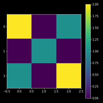
This is great! We’ve got a graphical representaion of our array. Each color maps a correponding value in the array and the scale of each axis represents the position of a value in the array.
As you might expect, we can make much larger arrays and visualize the values by colors.
Let’s combine many values⌗
Of course, the usual way to fill an array it’s not by typing it on the keyboard. Let’s create an array with values resulted from a calculation of two independent variables. We soon will see how we can achive the array just below quite simple from two 1d arrays.
{x0, x1, x2,..., xm}
{y0, y1, y2,..., yn} =>

_ _ _ _ _ _ _ _ _ _ _ _ _ _ _ _ _ _ _ _ _ _
| x0-y0 |  x1-y0 |  x2-y0 |  . . . | xm-y0 |
|- - - - - - - - - - - - - - - - - - - - - |
| x0-y1 |  x1-y1 |  x2-y1 |  . . . | xm-y1 |
|- - - - - - - - - - - - - - - - - - - - - |
|   .   |    .   |    .   |    .   |   .   |
|   .   |    .   |    .   |    .   |   .   |
|   .   |    .   |    .   |    .   |   .   |
|- - - - - - - - - - - - - - - - - - - - - |
| x0-yn | x1-yn  | x2-yn  |  . . . | xm-yn |
- - - - - - - - - - - - - - - - - - - - - -
Array of values combined by an arbitrary function.
The number of elements of each type, m and n, may
or may not be equal.
Say we want $x$ as well as $y$ values in the domain $-5\leq x,y\leq 5$ and we want to plot the sum of the sine values for a large number of combinations of $x$ and $y$.
In order to organize a resulting array according to the above example,
we can get helped of the NumPy’s function meshgrid(),
lowerX, upperX, numberX = -5, 5, 125 # 125 x-values between -5 and 5
lowerY, upperY, numberY = -5, 5, 125 # 125 y-values between -5 and 5
x = np.linspace(lowerX, upperX, numberX)
y = np.linspace(lowerY, upperY, numberY)
xx, yy = np.meshgrid(x, y)

# Create an array z containing the sum of
# the sines for each value of x and y.
# z will be a 125x125 array in this case.
z = np.sin(xx) + np.sin(yy)
Let’s plot the z array, the sum of sine of each mapped $x$ and $y$ value,
like the plot in Figure 1 above:
# Let the axis reflect the x and y values rather
# than their position. By default, the origin is in
# the upper left corner, at the array's first value,
# See Figure 1. In order to match the coordinates we
# need to move it to the lower left.

plt.imshow(z, extent=[lowerX, upperX, lowerY, upperY],
           origin='lower')

plt.colorbar()
plt.show()
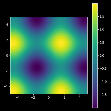
Yes! We have colorized the range of the equation $z=\sin x + \cos x$. We see the “hot spots” (yellow spots, close to 2) and the “cold spots” (violette spots, close to -2) building a periodic pattern over the $xy$-plane.
Levels⌗
Sometimes, one may be interested about just some values that satisfiy such
an equation. We can achive this by using the contour() function in Matplotlib,
like
CS = plt.contour(xx, yy, myData, [-1.9, -1.4, -0.9, 0, 0.9, 1.4, 1.9])
ax.clabel(CS, inline=1, fontsize=8)
plt.show()
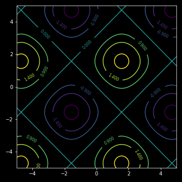
Here, we may get an idea of which pairs of $x$ and $y$ satisfying a given equation, e.g. $\sin x + \sin y = 1.4$.
We don’t need to go so advanced as trigonometric sums like above. For me, as a maths teacher, I think I even can make use of a similar plot with stright lines. The equation of a straight line is $Ax + By + C = 0$, for some constants $A$, $B$ and $C$. Or why not a circle, $r^2=(x+a)^2+(y+b)^2$, for some constants $a$ and $b$.
Bottom line⌗
The code for the generation of the spectrum like header image is below:
import matplotlib.pyplot as plt
import numpy as np
x = np.zeros([4, 240])
for i in np.arange(0, 4):
    for j in np.arange(0, 240):
        x[i, j] = j
fig, ax = plt.subplots(figsize=(10, 2))
plt.imshow(x)
ax.axis('off')
ax.set_aspect(10) # scale of x axis 10 times the scale of y.
plt.plot()
That’s all for now, folks!